What are Histograms: A Beginner’s Guide with Examples
Learn what histograms are, their types, and how to use them in data analysis. See examples and applications to improve your data interpretation.

Have you ever wondered how to visualize data trends easily? Whether you are a data analyst, a teacher, or just curious, histograms are one of the most powerful tools for understanding data distribution.
Unlike standard bar charts, histograms show how often values appear within specific ranges, making them essential for spotting patterns, trends, and outliers.
This guide will teach you about histograms, their key features, their different types, and how to use them effectively.
What is a Histogram?
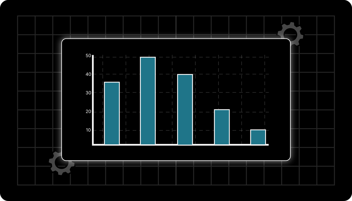
A histogram is a bar graph representing the distribution of numerical data. It displays the frequency of data points within specified intervals (known as bins or buckets), helping to understand the shape and spread of a dataset.
Features of a Histogram
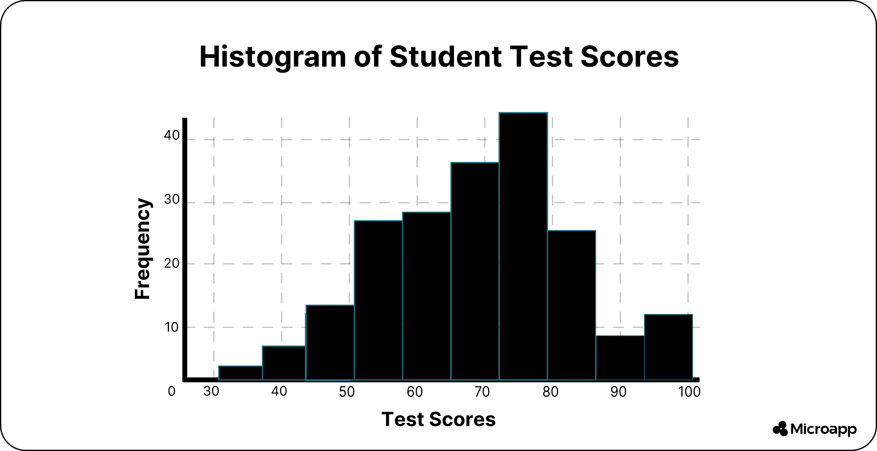
The image example above shows bars (bars represent frequency) at different heights, each indicating the number of data points within a specific range.
Compared to bar charts, a histogram has no gaps between the bars as they represent continuous data. At the same time, the horizontal axis (X-Axis shows data ranges-bins) represents intervals of values.
Lastly, your vertical axis (Y-Axis shows frequency) shows the count or percentage of data points available in each bin.
Example:
If you want to survey 100 students' test scores, you can create a histogram. The x-axis might have score ranges like 0-20, 21-40, 41-60, etc., while the y-axis shows the number of students who scored within each range.
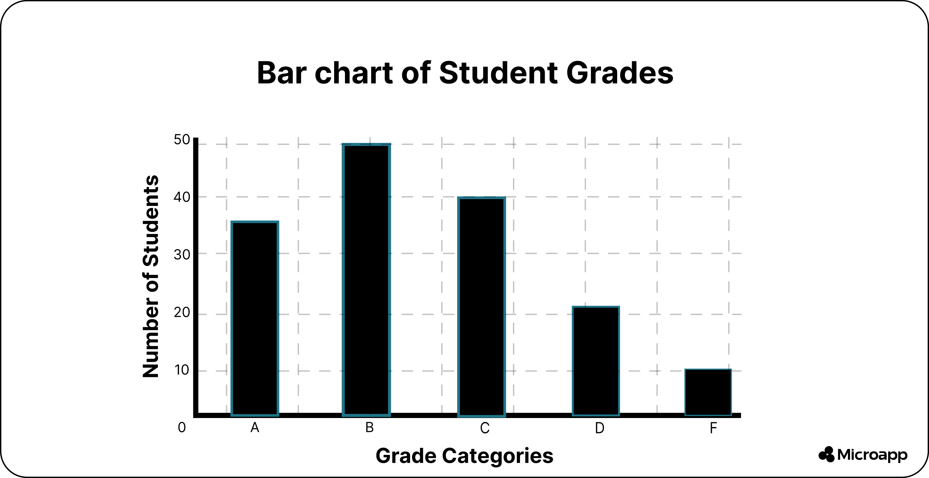
Difference Between Histogram and Bar Graph
One of the most commonly used graphs is the histogram. As you know, it defines how often each value occurs in a data set. Still, it looks the closest to a bar graph but has some differences.
How to Use Histograms
If you want to use histograms for visual analysis, you can use them to explore how members in a category or dataset are distributed.
For example, a salary breakdown can be done by examining the balance of your pay scale or counting bank members with an x amount in their account.
You can use it if you have one continuous value, you can split it into multiple bins, or if you want to understand the distribution of values in a single category.
Still, we recommend avoiding using histograms if you must analyze multiple dimensions simultaneously or your data sets are not scaled right.
Lastly, you want to compare a specific value of single data points.
Types of Histograms
A histogram can be categorized into various types based on the frequency distribution of your data. Here are the four different histogram distributions:
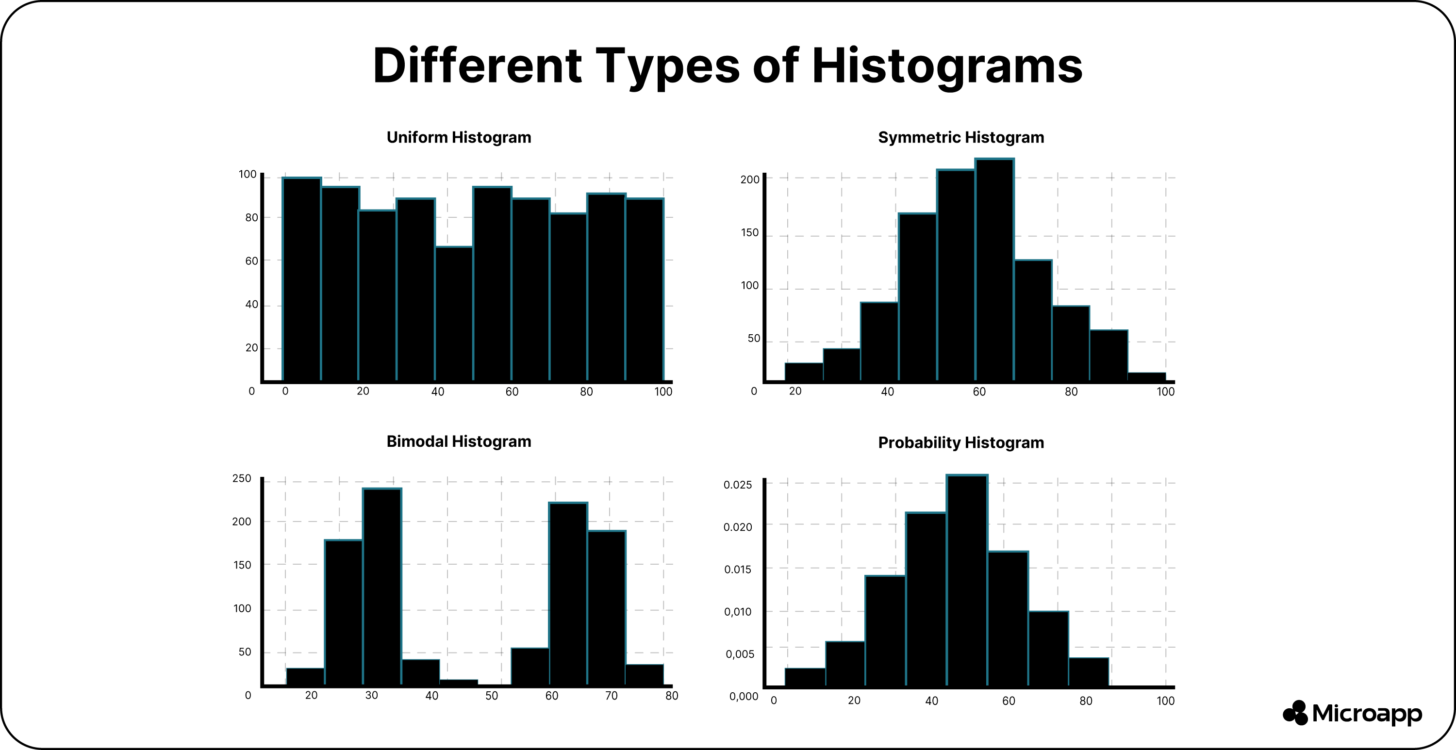
- In the uniform histogram, the data is evenly spread across bins.
- For the symmetric histogram, it follows a normal distribution with a single peak in the middle.
- The bimodal histogram has two distinct peaks, indicating two data groupings.
- Lastly, the probability histogram is normalized, with the total area summating to 1, which helps determine the probability distribution.
Histogram Applications
When you learn about the different distributions, you can quickly see the applications of histograms.
Normal Distribution
A normal distribution is a typical pattern shaped like a bell curve. In a normal distribution, data points are just as likely to appear on one side of the average as on the other.
It is important to note that other distributions can resemble the normal distribution. Statistical calculations determine whether a distribution is normal. The term "normal" refers explicitly to a specific type of distribution for a given process.
For example, some processes have a natural limit on one side, which can result in skewed distributions. In this context, the distribution is considered normal when it does not fit the standard distribution criteria.
Skewed Distribution
A skewed distribution is asymmetrical, meaning it has a long tail on one side due to natural limits. The peak of the distribution is off-center, shifting in the direction of the limit, while the tail stretches out in the opposite direction.
For example, a dataset measuring the purity of a chemical product would likely be skewed because purity cannot exceed 100%. Similarly, drill holes cannot be smaller than the drill bit, and call durations cannot be negative.
These distributions are classified as right-skewed (tail on the right) or left-skewed (tail on the left), depending on where the longer tail appears.
Multimodal Distribution
Also known as a plateau distribution, a multimodal distribution has multiple peaks. It is often formed when several normal distributions are combined. Instead of a single peak, overlapping data points from different sources create a plateau-like shape.
Edge-Peak Distribution
This distribution resembles a normal distribution but has an unusually high peak at one end. Errors in constructing histograms, such as grouping large values in a single "greater than" category, often cause this.
Comb Distribution
A comb distribution is characterized by alternating tall and short bars. This pattern usually emerges when data is rounded or the histogram is incorrectly constructed.
For instance, if temperature readings are rounded to the nearest 0.2°C but histogram bars are set at 0.1°C intervals, the result would resemble a comb-like pattern.
Truncated or Heart-Cut Distribution
This distribution looks like a normal distribution but with its tails cut off.
It often occurs in manufacturing, where a producer creates a normal product distribution but removes items outside the specified quality limits.
The remaining products, which meet the specifications, form a heart-cut distribution, meaning only a specific section of the data is delivered to the end user.
Dog Food Distribution
A dog food distribution is incomplete, with missing data near the average. This happens when high-quality (heart-cut) products are separated, leaving only lower-quality items behind.
Although the remaining products still technically meet specifications, they cluster around the upper and lower limits rather than the center.
This inconsistency can create issues in the end user's processes.
Wrap-Up: Construct Eye-Catching Histograms
The histogram is a powerful tool for data analysis. It allows you to examine continuous data to determine its skewness, shape, and outliers.
It is useful when looking at each data point is not feasible, such as when using large data sets.
Still, knowing the bin sizes is essential when creating a histogram. Selecting an inappropriate number of bins can cause you to overgeneralize your data or even fail to conclude.
To make creating your histogram easier, check out our tool to make a visually appealing impact today.