The Complete CSS Animation Guide: Everything You Need to Know
Learn how CSS animation can enhance your web design with vibrant effects. Learn essential techniques to keep your users captivated and improve engagement.
As a web designer, you know that it is ever-evolving. One way it is evolving is with CSS animation. It offers a fantastic way to provide the best user experience while keeping them engaged.
So, one of the best ways for you to be a web designer is to harness the use of Cascading Style Sheets (CSS). For this reason, we use a CSS animation generator to bring our website to life.
With it, you can create stunning animations that grab your audience’s attention without using JavaScript. Your keyframes and transitions play a considerable role in this.
What is CSS Animation?
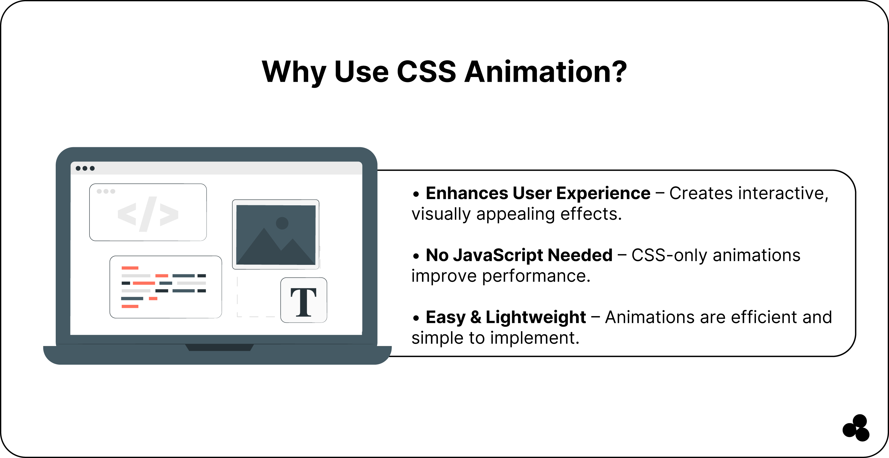
With Cascading Style Sheet Animation, you can animate your HTML element without using JavaScript. When you define your keyframes and use the “@keyframes” rule, you can liven any property, like the color, position over a selected duration, and size, to create engaging and dynamic interfaces.
How to Add CSS And Use Them
The fantastic thing is you can use animation in different ways in a project:
1. You can add your CSS directly to your HTML element, known as inline CSS, by using the “style” feature, as seen in this example:
2. Or you can create your CSS file separately to link to your HTML file by using a “link” element in the HTML file head as seen here:
CSS Animations Browser Support
When you create your animation, you can use it with different browsers, but some will provide full support, while others only offer limited support, as seen in this comparison table:
Important Notes
Opera Mini does not support CSS animation, while Internet Explorer 10 requires the “-ms—prefix” for it to work. Older versions of Safari and iOS Safari before the 9.0 update have limited support, and you need the “-WebKit—” prefix.
Browser Compatibility Summary
As a designer of modern web designs, we know you rely on cutting-edge features. However, backward compatibility remains paramount.
While some browsers, such as Safari, Mozilla Firefox, and Google Chrome, support CSS animations, your older version might not be reliable enough. The tricky thing is that it might leave many users who are still using them behind.
For this reason, it helps to ensure you use techniques for cross-browser functionality using vendor prefixes. These techniques can help complex animations perform well, even if specific browsers vary.
We recommend using the @keyframes with your prefixed equivalents, such as moz-keyframes and webkit-keyframes, to help enhance reach. With them, it will ensure that users who lack support can still enjoy a seamless experience with animations.
You can look at polyfills and scripts to help emulate the missing functionality, as they help browsers that follow the race.
Your most significant measure of victory is consistency across your parallax effects and transitions, synchronizing from a desktop to a mobile device.
More About CSS Animation Properties
When it comes to creating animations on your web page, it is all about the CSS animation properties. You can change as many properties as you like and do it as often.
Syntax:
Here is a table of each CSS animation property and a description of what it does:
How to Define Your Animation Sequence Using Keyframes
Keyframes are used to help define your animation sequence in digital media projects. They help mark specific points in a timeline where a change occurs, like changing the rotation or position or even scaling the object.
@keyframes rule
@keyframes rule { 0% { transform: rotate(0deg); }
100% { transform: rotate(360deg); } }
Setting Up Your Multiple Animation Properties
When it comes to setting up multiple animation property values, use the following syntax:
animation: <animation-name> <animation-duration> <animation-timing-function> <animation-delay> <animation-iteration-count> <animation-direction> <animation-fill-mode> <animation-play-state>;
As example:
This syntax will set your animation name to a fade-in for two seconds. The timing function will ease it out, and the delay will be zero seconds.
The iteration count is infinite, and the direction is normal, with the fill-mode forwards while the play state runs.
Furthermore, your animation name you use in conjunction with your animation duration and animation iteration count to help define your animation behavior.
On the other hand, animation duration helps specify the length that your animation must take to complete.
You can set it to milliseconds or seconds, depending on your needs. In our microapp, you can adjust the duration to control the speed at which your animation plays.
Furthermore, the animation delay specifies a delay before your animation starts for a more dynamic experience. You can set this in milliseconds or seconds to determine how long a person waits before your animation begins.
A worthy note is that this property will only affect the animation time and not the animation duration.
Setting Up Your Animation-Iteration-Count
Another fantastic thing we know you will love is setting the number of times your animation can run. The animation-iteration-count function allows you to specify the number of times it should repeat.
For example, if you want your animation to be seen twice, you set the function to two or use infinite for it to keep running. Here is the syntax you can use:
animation-iteration-count: 2;
or
animation-iteration-count: infinite;
Setting Up Animation Direction
Using the animation-direction function, you can even run your animation in reverse. It allows your animation to run in a specific direction.
For example, if you want your animation to go in reverse, you set your “animation-direction” function to “reverse.”
The same applies if you want it to move in alternate cycles, then you set it to the “alternate” function, and the syntax looks as follows:
animation-direction: reverse;
or
animation-direction: alternate;
Specifying The Animation-Timing-Function
Another helpful thing is you can set the speed curve of your animation using the “animation-timing-function.”
With it, you can control your animation speed. You can also specify your speed curves from ease-in, linear, ease-in-out, and ease-out as per this syntax:
animation-timing-function: linear;
or
animation-timing-function: ease-in;
or
animation-timing-function: ease-out;
or
animation-timing-function: ease-in-out;
Specifying the Animation-Fill-Mode
When using the fill mode, you have three options available. The first is the “none” option, which is the default value. This means your element will return to its original state once it completes the cycle.
The second is the “forward” function, which maintains the style value you applied during your last keyframe.
Lastly, you have the “backward” option, allowing your element to adopt the style value from your first keyframe and maintain the values until your animation starts.
Animation Shorthand
Another handy thing is using the animation shorthand CSS property, which allows you to specify your animation properties using code or a single line.
We found this helpful in defining our animation elements' behavior from the duration, iteration count, and easing. Here is the syntax for this property:
animation: <animation-name> <animation-duration> <animation-timing-function> <animation-delay> <animation-iteration-count> <animation-direction> <animation-fill-mode> <animation-play-state>;
Using Animation Events And Adding Animation Listeners
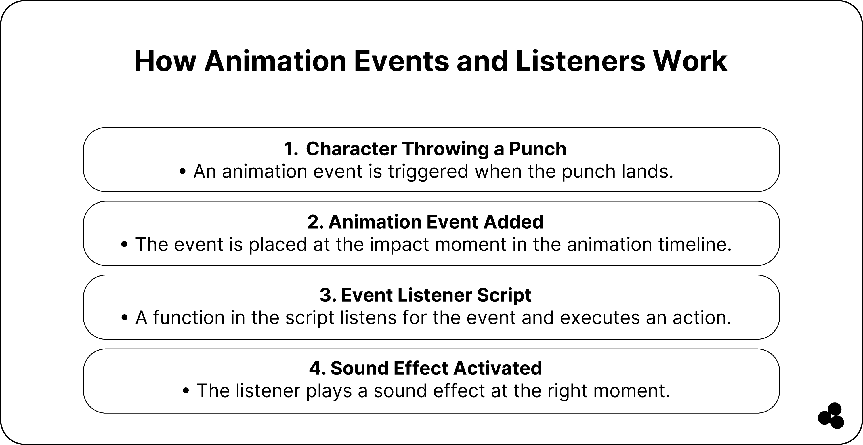
If you are a game developer, animation events will become a helpful tool, as they trigger specific behaviors or actions during your game sequence.
For example, you have a character but want it to have a sound effect when landing a punch. This is where events help to activate that effect during a special attack.
You can add it to the animation clip in your game to trigger it at a certain point within the timeline. So, it allows you to fine-tune your sequence and timing of events in the game.
Still, to use animation events, you first need to add animation listeners to your game script to listen to that event.
You do this by creating a function to call when your events are triggered and assigning it to your animation event clip.
We can use our previous example here, but you want the sound effect to happen when your character first collides with the enemy.
You will first create a function within the script to play the effect and then add the animation event when the character's fist hits the enemy.
So, you will assign the function playing the sound effect as your event listener. Still, a worthy note is that you must have a script attached to your game object to receive the event.
As in our previous example, the script must contain the function called when the events are triggered.
Types and Applications of CSS Animation
CSS animation you find available in different types to use in various applications as seen in our table here:
CSS Animation Examples
Here, we have two examples of writing CSS animation code.
Example 1:
In the above example, 0% is your starting point, while 100% is the end.
Example 2:
The example above 0% is the start of your animation, and it ends at 100%.
Here, you see the ease-out value we used, which is set to slow down our animation at the end.
Furthermore, the animation interaction count shows the number of times our animation currency “i” needs to play generally, while the default value we have set on our animation iteration count is 1.
On the other hand, the animation-fill-mode defines the element style when our animation is active.
We used the ease-out value above to set our animation to a slow end.
Considering all of this, there is a simpler way to create fantastic animation easily using our CSS Animation Generator Tool. Check it out now.
Wrap-Up: Start Working On Your CSS Animation Today
In our article, you learned about the values of animation properties and how you can use them to help animate any element of your web page.
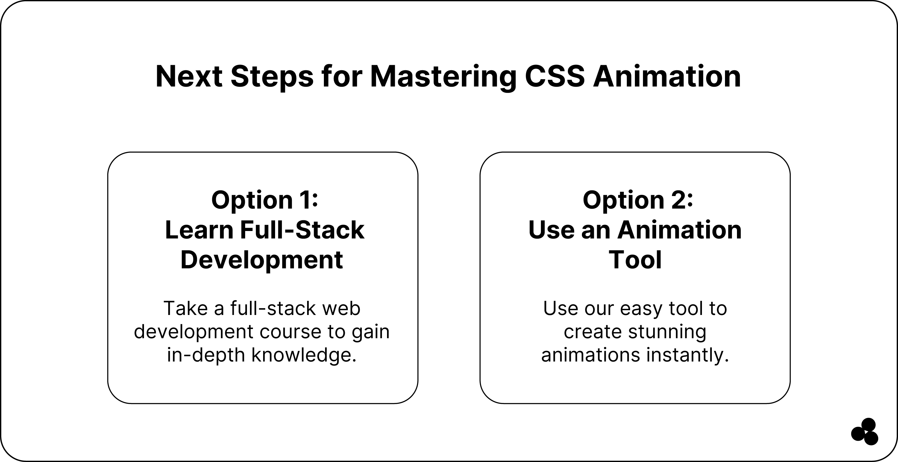
Still, if you want to enhance your knowledge, we recommend investing in a full-stack web development program. With a course, you can learn everything from coding to software development skills to gain the necessary knowledge.
You can also use our easy tool to create fantastic animation for your website.


