Histograms vs Bar Charts: When Should You Use Them? (+Helpful Tool)
Histograms and bar charts are excellent for presenting complicated data. But when should you use them? Find out here.

Whether at work or school, we are sure you have used histograms or bar charts to present your complicated data in an easy-to-understand format.
These charts are simple and widely used for sales or financial analysis, quality control, and market research.
While they may look similar, histograms and bar charts (bar graphs) have different use cases. How do you determine when to use the one over the other?
Still, before answering the question, it is worth noting that creating your histogram using our microapp is easy and only takes a few minutes.
Histograms vs Bar Charts: What Are They?
Personally, we at Microapp have used both of these charts for different purposes. We will explain them here to help you choose the best option.
Bar Chart/Bar Graph
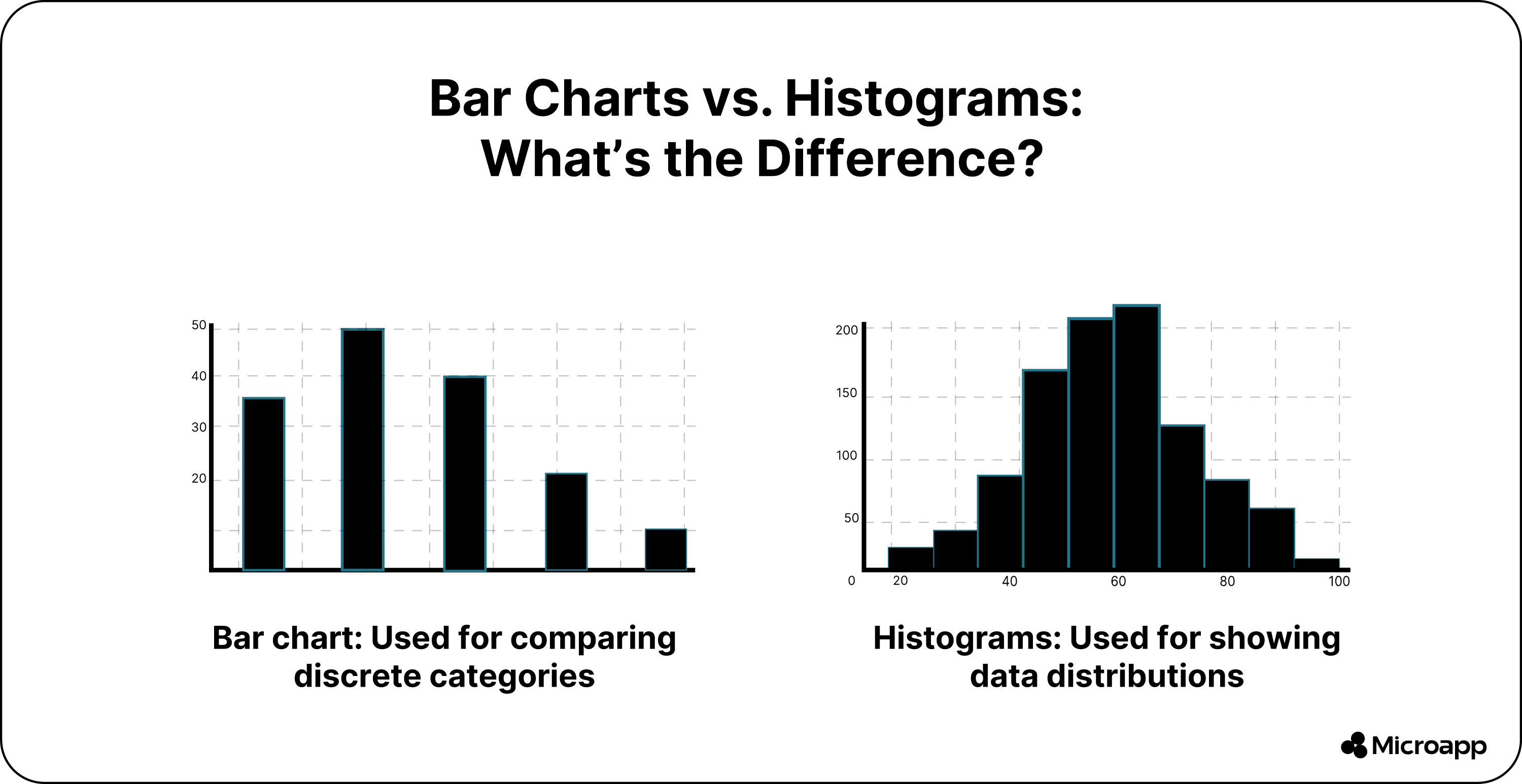
We used the bar chart to visualize and compare our discrete data categories and groups and compare them. A bar chart is best when you want your data in separate horizontal bars (=bar chart) that are not adjacent to one another or in vertical columns (=column chart).
This is because when you visualize data in separate columns, you can compare them easily. For this reason, using bar charts is typical for your nominal and categorical data—for example, months, product categories, discrete values, cities, and more.
Histogram
On the other hand, a histogram provides a visual representation of your data distribution. The chart consists of continuous rectangular bars.
The width of each bar represents a range of values, while the bar's height depicts the data's frequency. The two charts look similar and believe us, you can quickly get confused.
In histogram terminology, the range of values is referred to as bins or equal intervals, and each interval depicts a bar on the histogram.
Bar Charts vs Histograms: When to Use Them?
We found there are some great ways to use these charts in different circumstances, as seen here:
When to Use a Bar Graph?
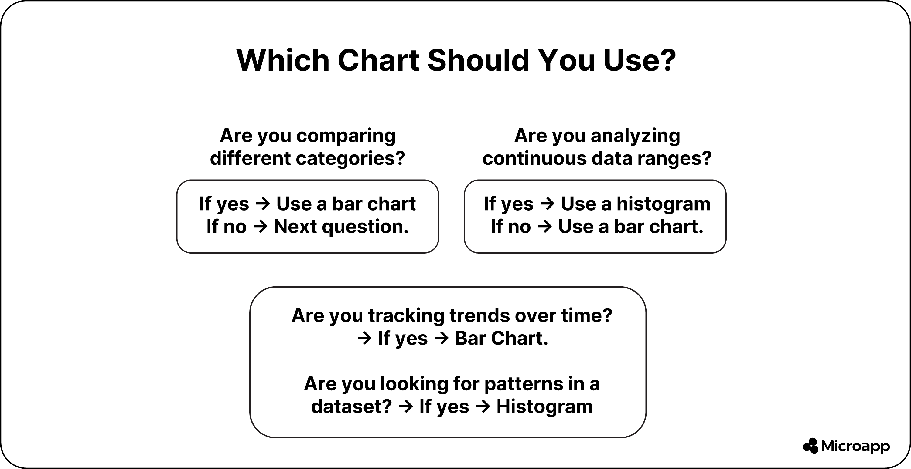
We found that bar graphs work best when comparing and displaying our data across different categories.
Compare and Contrast Data
We have used bar charts to compare data or our values associated with various categories. You find the rectangular bars' different heights and lengths, making it easier to visualize and evaluate your differences with a glance.
Help Track Changes
A bar chart is the best tool for tracking changes or trends. It allows you to plot your data and notice changes over time.
Using the bar chart made identifying shifts, fluctuations, or patterns easy. The best part is that we changed the colors or our trend lines to help highlight the direction and extent of the changes.
The bar chart is perfect for tracking market trends, sales figures, or other time-based data.
Help to Visualize Qualitative Data
Besides using the chart for numbers, you can use it, for example, to present global access to HIV treatment. You can even use it with qualitative points like who and who had no access and plot it on your chart. The bar height would then depict the frequency.
When to Use Histograms?
We love using histograms to analyze our continuous data or when we notice we have limited the number of data points to a numerical range.
For example, it can measure time, temperature, and weight, which are different types of continuous data. Here are some great choices for using histograms:
Helps With a Distribution Analysis
Have you ever needed to understand the shape of your data? This is common in various professions, such as market research, finance, and insurance.
For example, suppose you are a financial analyst needing to analyze your stock returns in terms of skewed, regular, or any other distribution pattern for portfolio performance and to measure risk assessment using a histogram.
In that case, it is the best way to achieve the results.
Helps With Statistical Analysis
You can use histograms in any statistical analysis as it provides a visual presentation of your data. You can easily spot patterns and variability to make informed decisions.
For instance, if you work for a government agency, you can use the chart to analyze your income distribution in a specific population to help visualize points like median and mean to assess the significance of policies.
Helps Identify Outliers
Outlying data has enormous implications that are missed on a bar graph. However, a histogram can easily detect extreme values or outliers outside your typical range. Furthermore, it has practical implications for different professions.
For instance, if you are part of a marketing team and want to know the outliers in your customer behavior, like high or low spending patterns, target segments, or identifying fraud, you can use it for your marketing strategies.
Check out our Histogram Maker here.
Bar Graphs vs Histograms: Advantages and Limitations
While both charts are helpful, they do have limitations.
Advantages Bar Charts:
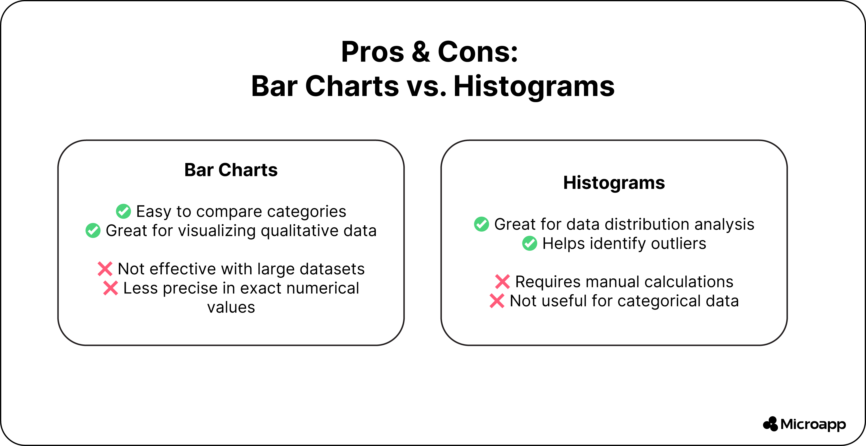
- It's easy to understand. The presence of the bars makes it simple to compare your different categories and variables.
- Flexible presentation options - you get different stacked, vertical, and horizontal bar charts to present your data.
Limitations Using Bar Charts:
- It is less effective with large datasets, particularly when the categories or data points increase as the bars become crowded. This makes it difficult to compare or interpret the data.
- It lacks preciseness as the length of the bar only gives you a general sense of the relative values and not the exact numerical measurement. So you cannot make a precise comparison between your various bars.
Advantages of Histograms
- You can quickly identify and understand patterns, giving you a unique insight into your data.
- You can detect anomalies in your data or values outside your typical range.
Limitations With Histograms
- Manual statistical calculation is needed and very time-consuming, leading to errors.
- Using a histogram is only effective for data falling within a range and not with qualitative variable studies.
The Difference Between a Bar Graph and Histogram Summarised
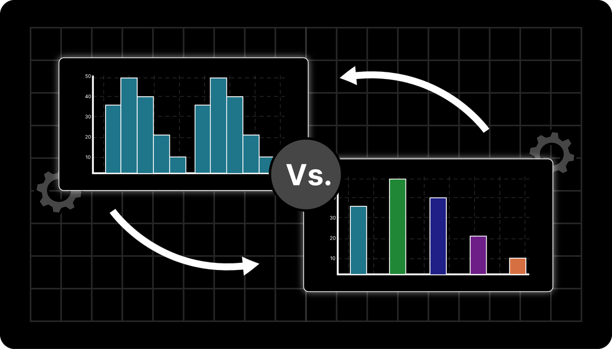
While both charts have a column-based display, you can use the bar chart to compare categorical or discrete variables using a graphical format. In contrast, histograms represent the frequency distribution of variables in your dataset.
Histogram vs. Bar Chart
Wrap-Up: Bar Charts vs Histograms
Both bar charts and histograms are potent tools for visualizing data, but their effectiveness depends on your specific use case. A bar chart is your best bet to compare categories or track changes over time.
On the other hand, a histogram is the best tool for analyzing data distribution, identifying outliers, or conducting statistical analysis. Understanding the differences between these two charts ensures you present your data clearly and make informed decisions.
And if you want to create your histogram effortlessly, try our Histogram Maker to get started in minutes.