5 Tailwind Best Practices to Avoid a CSS Nightmare In React
Tailwind CSS and React offer you loads of benefits. But you can face problems a long way. Check out the best practices of Tailwind to avoid this.

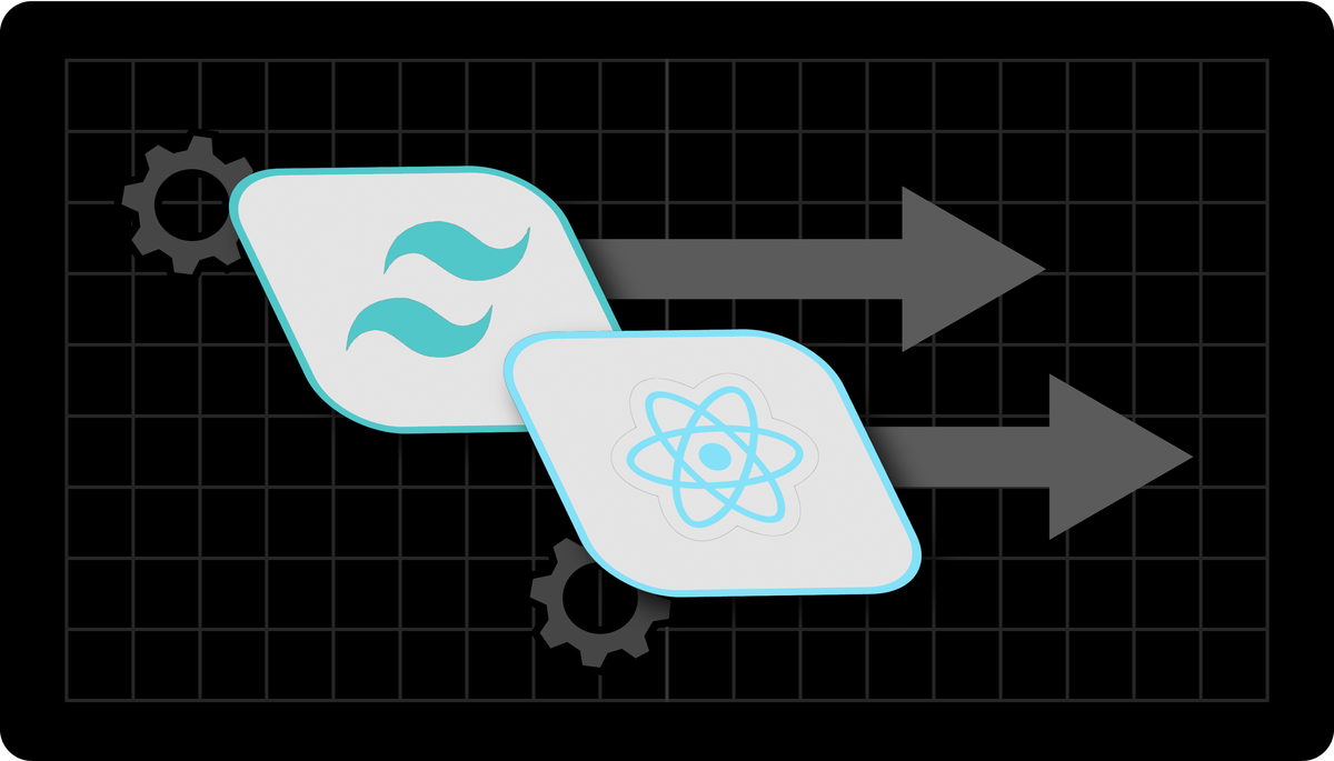
As a developer, you can benefit from using Tailwind CSS in React. This utility-first CSS framework provides pre-built utility classes to build a responsive, customizable user interface.
Still, there are some best practices when using Tailwind CSS to prevent a nightmare in React. With it, you can keep your application organized, manageable, and clean as your project grows.
What are Tailwind CSS and React?

Tailwind is a utility-first CSS framework that allows you to style elements quickly using the pre-defined classes in your HTML files.
React, on the other hand, is a JavaScript library for building interactive user interfaces. Together, these two applications are powerful tools for visually appealing web applications.
Hence, Tailwind offers you the needed styling tools while React handles the structure of your application.
Best Practices For Using Tailwind CSS
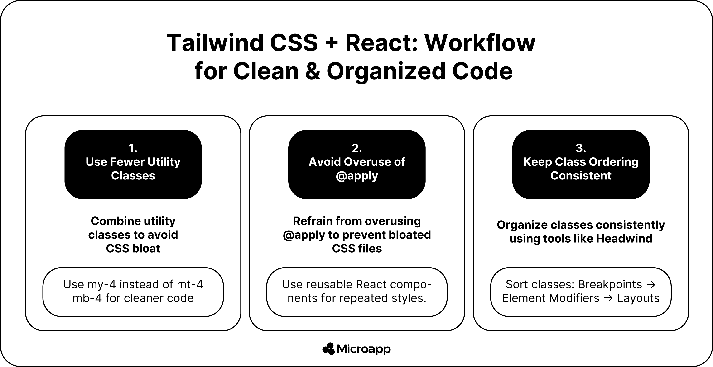
1. Make Use of Fewer Utility Classes
Tailwind CSS offers you excellent utility classes, but use them sparingly. You do not want to make your CSS bloated, as it can make it challenging to maintain. Instead, you can combine the utility classes where possible.
For example, if you use mt-4 mb-4 to add your top and bottom margins, use my-4 instead; it will make your CSS easier to read.
You will generate one CSS rule, not four, making the code more concise.
2. Refrain From Using The @apply To Clean Things Up
Try not to use @apply even if your HTML templates have many classes, as this can make them look messy. It is even worse to deal with tons of custom CSS in your project as it becomes messier.
When you use @apply for everything, you rewrite CSS, and Tailwind’s organized workflow is lost. Furthermore, it invites a bad abstraction with a change that causes issues in the future.
Disadvantages of Using @apply
- You will have to think of class names the whole time.
- You will be jumping between different files to keep making changes.
- What is even scarier is changing the styles, as CSS is global, and before changing anything, it can break your whole website.
- The CSS bundle will grow and become more prominent, and this is something you do not want to happen.
Great, but what should you do when you reuse the same style repeatedly? If you must reuse your styles in a single file, you can use multi-cursor editing, loops, and maps.
Create reusable components for each element of multiple files. With the code, you can use it multiple times in an application and do so using React.
3. Keep Things Consistent
It helps to keep your CSS class ordering consistent. Why? If you throw a utility class on an element in no order, the styles become challenging to debug and read.
By keeping them consistent, the CSS is easier to maintain and read. So you will be able to spot conflicting classes more easily.
For instance, if you place your breakpoint modifiers first, then the element modifiers and layouts last, you will quickly notice if you have a conflicting class like md:mt-4 mb-4.
Furthermore, it is helpful when you review your code and work with a team of developers to scan it and understand what it is doing. So, how do you organize these classes?
You can use something like Headwind to sort your classes automatically.
4. Make Use Of The Design Tokens
Design tokens help store and manage design variables such as spacing scale, color palette, breakpoints, and typography scale.
With it, you can create reusable, consistent styles that update quickly and are easy to maintain. However, before using it, you must create a set of tokens representing different design elements in the system.
You can create your design token using the tailwind.config.js file. This allows you to centralize the design tokens and make them accessible to all the Tailwind CSS classes. To do this, you can use the theme object.
It is a JavaScript object that contains the default values for all the Tailwind CSS utility classes.
You can add your design tokens to it, and Tailwind will use them to develop utility classes. You can create consistent, reusable, and scalable designs with design tokens.
5. Make Use Of The Utility Classes
Tailwind CSS has many pros and cons but offers many utility classes. We recommend using them.
The first is the responsive utility classes, which help you create responsive designs. With them, you can apply different styles to elements based on screen size.
So, if you want the utility to take effect at a specific breakpoint, just prefix the utility with your breakpoint name followed by the (:) character.
For instance, to change the background color of a button on a medium or larger screen, you can use mg:bg-red-50,0, which will work on different devices.
When the screen size changes, you can change anything, even minor details like the spacing between letters or the appearance of your cursor.
Next, use the dark mode utility classes, which allow you to apply different styles to elements based on your user’s preference.
Wrap-Up: Summing Up Tailwind Best Practices
For a powerful tool to make your website visually appealing, combining Tailwind with React makes it possible. Still, it helps to follow some rules to prevent chaos in your project.
Always minimize the number of utility classes where possible. Formulate code conventions by grouping design tokens and naming them semantically.
Also, consistent class ordering should be implemented, ensuring code cleanliness and minimizing bundle sizes by including only the needed styles.
Tailwind and React are powerful tools for working hand in hand.